A Responsive Website For A Multi-Platform World

A website that works perfectly on all devices, from phones to personal computers, is not a luxury anymore; it's a necessity in a multi-platform world — get responsive web design from The Digital Add's web development studio.

  • ● More mobile traffic
  • ● Lower bounce rates
  • ● Easier analytics reporting
  • ● Improved SEO results
  • ● Great user experience

A responsive website has a 16x better conversion rate.

Custom Responsive Website Design Services

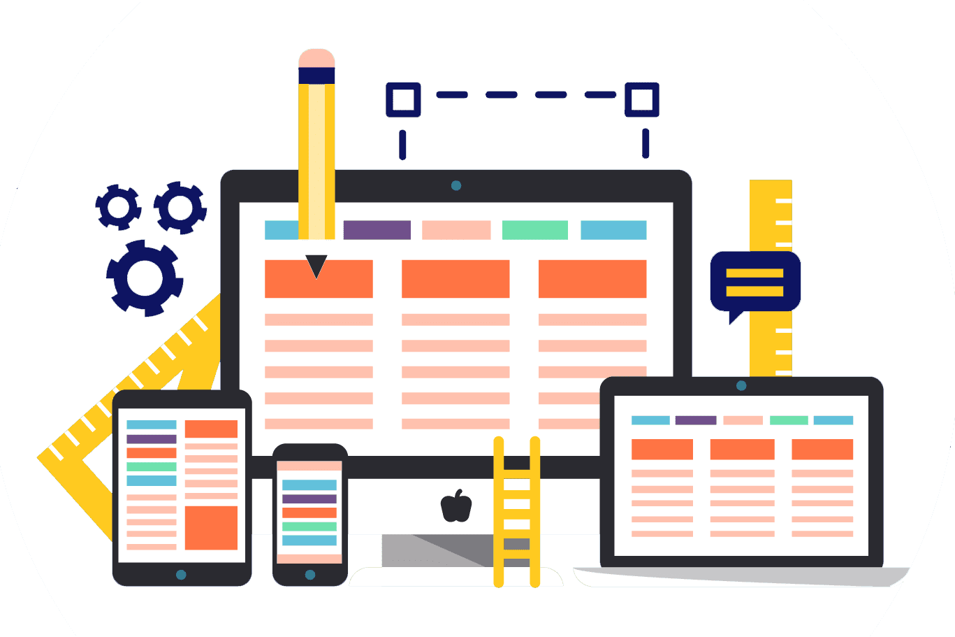
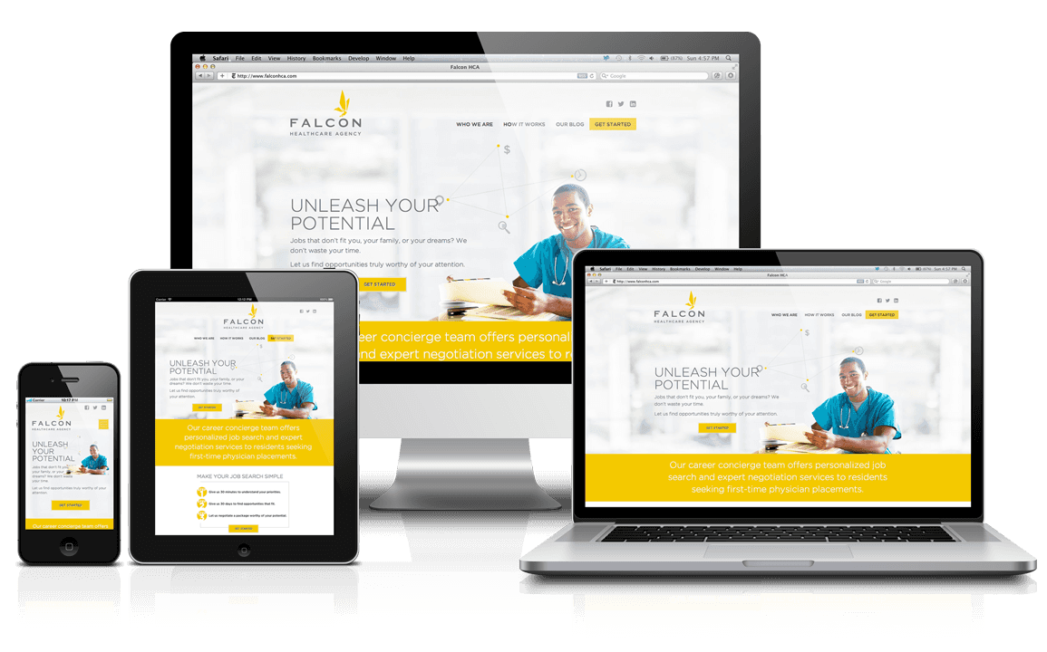
The Digital Add combines the best elements of design and technology to produce the most dynamic and compelling responsive website for your business. Be it mobile devices like phones or tablets or fixed ones like your personal computer, your web products, when designed by the unique high-end responsive architecture developed by The Digital Add, look equally attractive on all platforms and adapt seamlessly to screens of different sizes without any distortions or failures. All the custom-built elements you need for the advancement of your business are designed with responsive architecture to make sure that they perform optimally across platforms. We understand that the key to a responsive web design is not different codes for different devices but a smart code for all devices, one that can adapt to new conditions.

Work Process

01. Brainstorming

After a discussion with your representatives, our website-development experts translate your business requirements into technical parameters.

02. Design

We create a compelling and captivating design that fully integrates the requested features and resonates with your brand's personality.

03. Development

The Digital Add's Website Development Studio works on the website's architecture to create a robust and reliable product for your business.

04. Testing

The website developed by the studio is tested to ensure that it performs well and fulfills the criteria set by you. Any bugs found during testing are fixed.

05. Delivery

A fully-optimized, bug-free website is launched with all features requested by you and handed over to your team for regular operations.

06. Support

We provide full support after deploying project to production server. We are reachable anytime.

Drive Digital Growth With Responsive Web Design

By making it easier for visitors to navigate your site across devices, The Digital Add's responsive web design can help you convert more visitors into customers.

1

Mobile-friendly pages

People who are browsing on their phones are more likely to buy something when compared to those who are looking at it from their desktops.

2

Improved SEO

A responsive design makes your website easier to navigate and read, which gives it a better chance of ranking higher in search engine results.

3

Large audience base

With more people accessing the internet with mobiles than other devices like PCs, your brand can reach a larger audience with responsive design.

success

Frequently Asked Questions

A responsive web design aims to create a website that looks the same on any device, including smartphones and tablets. A responsive site adjusts itself to the screen size of the user, so it will look good and work well on any device. A responsive web design also helps users save time by saving them from having to switch between devices while browsing your website. By contrast, a fixed-width design assumes that all visitors use a certain type of computer or other devices. If one of your users has a wide desktop monitor, for example, your website will appear very narrow to them. A fixed-width design can't adjust itself to different screen sizes.
There are many reasons why you need a responsive website. For example, if you have a website that can be used on any device, you may choose to make it responsive so that it looks good no matter what kind of device is being used to view it. This would save you time and energy in the long run because you would not have to spend time designing multiple versions of your site. A responsive web design can also improve your SEO, which makes your content more likely to be found. People are more likely to click on an article if they can see the whole text and are not compelled to skip over it because they cannot read it. A big advantage of a responsive web design is that it will make your website accessible for users with disabilities.
Responsive web design is one of the key elements of SEO or Search Engine Optimization. The main reason why it's important to incorporate responsive web design is that it makes your site look more visually appealing and more user-friendly. It also makes your site easier to navigate and read, which gives it a better chance of ranking higher in search engines. When a search is done on a mobile phone, search engines are likely to show websites optimized for mobile use at the top of the results.
Responsive web design utilizes the latest HTML5, CSS, and JavaScript architecture to build fluid, responsive layouts. For example, it provides features like media queries that are capable of detecting browser resolution and CSS scripts that have the ability to adapt elements based on the layout of the device being used. It ensures that the website design is able to adjust to screen size and browser window by specifying dimensions in percentages. The Digital Add has developed its own responsive framework to build websites that look equally attractive on all platforms and adapt seamlessly to screens of different sizes.
Yes, it is possible to convert an existing website into a responsive one. However, a lot of the existing elements, including architecture and graphics, will have to be redesigned. While the content on your old website can be repurposed, some advanced codes will have to be added to the framework to make the design responsive in the truest sense. Reach out to The Digital Add to find out more about how we can convert your existing website into a responsive one.
Switch Theme